We're happy to be nominated in four categories for the Reader's 2024 Best of Chicago poll. Find them all here and cast your ballot by December 31!
CHIRP Podcasts
Podcasts on the topic of “Higgs Boson” 1 results
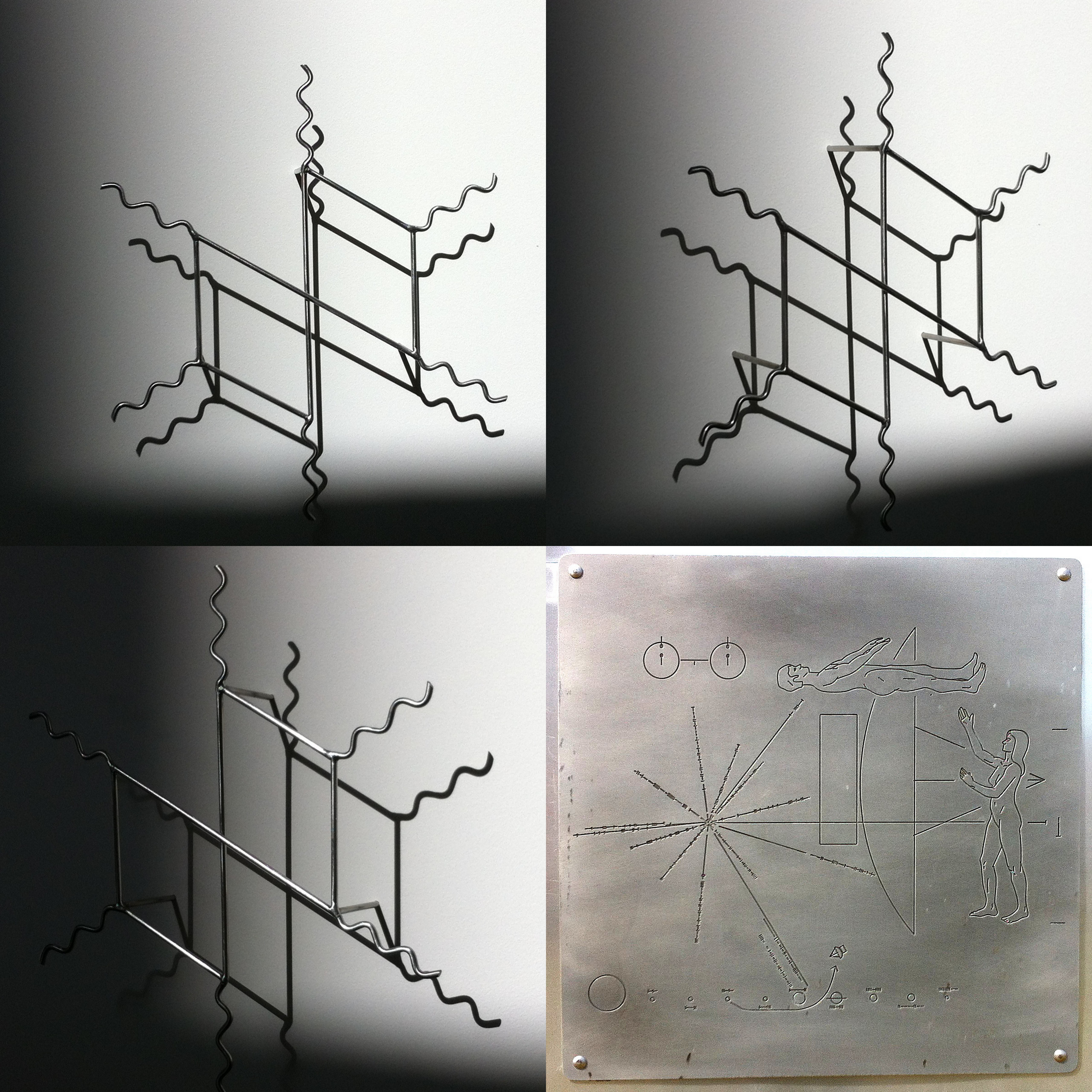
News Intense Seeing - The Cognitive Art of Feynman Diagrams

If you’re into infographics, then you probably know about Edward Tufte. He’s arguably the world’s foremost expert in the visual presentation of data, and leader of the campaign against “chartjunk,” the gimmicks and gadgets that frequently adorn and confuse the graphs, tables and charts we see online, in print and at work. When he’s not working on a new book or teaching his one-day course on presenting data and information, Tufte spends his time making sculptures.
A collection of his sculptures is devoted to what Tufte himself calls “maybe the greatest data visualization ever done,” a way of graphically depicting sub-atomic particle behavior developed by physicist and Nobel laureate, Richard Feynman. Appropriately enough, an exhibit of that collection is on display at the Fermi National Accelerator Laboratory (Fermilab) until June 26th.
CHIRP’s Dan Epstein went to Fermilab recently to talk with Tufte, and with physicist John Campbell, about Feynman diagrams, and the “intense seeing” that art and science have in common.
Special thanks to Don Lincoln of Fermilab for providing additional background and a Feynman diagram calculation.
produced by Dan Epstein
Download this episode Subscribe to all podcasts Subscribe to all News podcasts